Regan Forer - UX Designer
Regan Forer - UX Designer
A Room to Grow Preschool has two locations in Kauai, and provides an interactive preschool environment for children between 2.8 years-old and 6 years old.
The preschool's main (and only) online presence was a Facebook page for the school. The director of the preschool realized they needed a more appropriate digital face for the school. As such, I was brought in as a UX and UI designer to design and build the school's first website.
The Company


Project Overview
Project Overview
Project Duration:
May 2022 to July 2022
!
The Problem
As one of the top preschools in the area, A Room to Grow has a relatively large roster of children at both of their locations.
Although their company was growing and expanding, their digital face had not been updated in many years. The school's primary - and only - online interface was the school's facebook page. Although useful for social media purposes, Facebook is not an ideal platform to hold the position of a company's sole digital interaction portal.
Because of the lack of a proper digital portal for their business, parents of current students at the school, as well as potential parents shopping around for information on preschools, were finding it difficult to get accurate information from and/or about the school.
The school brought me on to perform UX research, UX design, and UI design for a full website for their school.
My Role
On this project, I was the sole UX/UI Designer as well as the UX Researcher. Additionally, after the UX portion of the project was complete, I built the website for the school on Wix.
The Goal
The goal was to create a fully responsive website built around the needs of the primary users (the parents of current students), and the secondary users (parents seeking information about the school in order to make an informed decision as to whether or not to attend the school).
Outcomes would ideally encompass greater ease of communication and information relaying for the current parents, and an increase of ease for potential parents to be able to find out thorough and up-to-date information about the school.
The benefit for the company would involve a greater level of visibility to acquire new students as well as dealing with less frustration in communication and information dissemination with the parents of current students.
Responsibilities
-
User Research
-
Data Analysis & Synthesis
-
Wireframing
-
Prototyping
-
Usability Studies
-
Iterative Designs
-
Accessibility Considerations
-
Responsive Platform Design
-
User-Centered Design
Understanding
the User
User Research
Personas
Problem Statements
User Journey Maps
Understanding
the User
User Research
Personas
Problem Statements
User Journey Maps
User Research: Summary
User Research: Summary
Parents and caregivers to children have a lot on their plates everyday. Many of them work jobs at a company full time in addition to their full time job taking care of their tiny humans. Because of their busy lives, parents need to be able to acquire information and execute communications in a fast, efficient manner.
The user research for this project revealed several pain points among parents whose children currently attended the school, as well as parents who were shopping around in an attempt to decide upon a preschool for their children.
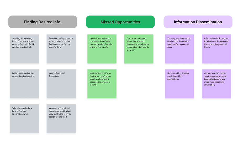
As the school had no website, and only a Facebook page, both groups of users expressed frustration at how difficult it was to try to find out information about the school. Having to scroll through a Facebook feed going back years in order to gain information was cumbersome. The lack of categories on Facebook also made it difficult to group information in a way that would allow users to easily find it.
As there was no centralized website to focus the SEO for the school, several eronious contact numbers would show up through Google searches, making it difficult for users to actual find accurate contact information for the school.
Additionally, parents with children currently at the school expressed frustration at how difficult it was to find out important information. The school's main portal for communicating with current parents is the Brightwheel app. The way the school has chosen to administered the app., all information relayed by the school is placed in the same feed thread, meaning that a busy parent must scroll through the feed (perhaps through weeks worth of posts) to find out information about a certain fundraiser for the school, or details for the next field trip...etc.
Another frustration expressed was the system for the dissemination of information and forms pertaining to the school. Through Brightwheel and the school's Facebook page, forms and documents for the school online were not downloadable. In fact, all forms and newsletters were printed out by the school, then photographed, and then that photograph was posted in the single feed thread on Brightwheel. Parents who are shopping around for a school and wished to fill out the waitlist form, were also met with these pictures of printouts for the waitlist form instead of having a downloadable form, or a fillable form that could be submitted online.
The conclusion was: users were frustrated by the lack of an easy-to-navigate, centralized system for information for all facets of the school.
User Research: Affinity Diagram
User Research: Affinity Diagram

User Research: Pain Points
User Research: Pain Points
1
1
Wrong Information
Both parents of current students, and parents of potential students found it difficult to locate correct contact information for the school. Online searches would generate results with incorrect contact information.
2
2
Form Frustration
All forms for the school were only available to be acquired in person as a hard copy, or could be downloaded from the FB page as a photograph of a printout. Forms could not be filled out electronically, and could only be returned to the school in person.
3
3
Information Convenience
With a long feed as the only way of relaying information, parents had to scroll through weeks of posts in order find out a piece of information on a specific item.
4
4
Information Dissemination
With information hidden in the long feed, many parents were frustrated at not knowing when new information was released.
User Research: Personas
User Research: Personas
User Research: User Journey Maps
User Research: User Journey Maps
Starting the
Design
Paper Wireframes
Digital Wireframes
Low-Fidelity Prototype
Starting the
Design
Paper Wireframes
Digital Wireframes
Low-Fidelity Prototype
Starting Design: Site Map
Starting Design: Site Map
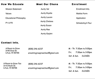
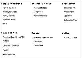
Moving forward with the information collected from the user research, I constructed a site map to begin laying out a basic outline of the responsive website.

Paper Wireframes
Paper Wireframes

Digital Wireframes
Digital Wireframes
Low-Fidelity Prototype
Low-Fidelity Prototype
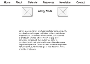
With all of the information gathered through user research, I created a low-fidelity prototype.
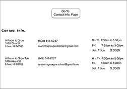
The Lo-Fi prototype began to address user issues and pain points, including those for a system of categorized and easy-to-find information, as well as a straight-forward source for contact information.
Refining the
Design
Usability Study Findings
Mockups
High-Fidelity Prototype
Accessibility
Refining the
Design
Usability Study Findings
Mockups
High-Fidelity Prototype
Accessibility





View the Full Prototype:
Usability Study: Findings
Usability Study: Findings

Round 1 Findings
1
2
The schedule page was modified from links that separated it into "previous" and "current" months to a single scrolling schedule. The schedule was still divided by months, but the items and the months all appear on the same long scroll. Users found this more convenient and the KPI of "time-to-complete-task" demonstrated users were faster and less frustrated when operating the new long scroll format
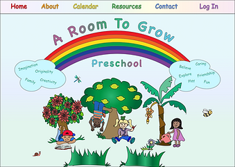
The use of the rainbow menu design was not as efficient as it should be. Due to this, the rainbow menu was removed, and replaced with a straight-across menu, to allow for easier navigation
Round 2 Findings
1
2
Back arrows were added to a few of the pages that stemmed from landing pages & not from menus. This allowed for easier navigation back to the main landing page, so the user wouldn't have to reroute through the top menu again.
On the School Schedule page, I added a link to the calendar at the bottom of the schedule's page. The usability studies found the user's wishing to reference the listed schedule against the more visual calendar option. Because of this, linking the two via a quick button press made sense for the user.
3
Overlay lightboxes replaced the previous separate navigation page for the school projects. This change allows users to quickly gain information about school projects, and then allows them to quickly return to the projects landing page
Usability Study: Revisions
Usability Study: Revisions
Mockups
Mockups
High-Fidelity Prototype
High-Fidelity Prototype
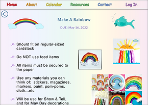
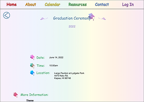
The most recent high-fidelity prototype addresses user needs for access to assigned songs, ability to sign up for committees, and back arrows for non-menu landing-page options.







Going
Forward
Lessons Learned
Take-Aways
Next Steps
Going
Forward
Lessons Learned
Take-Aways
Next Steps
Accessibility
Accessibility
Accessibility Considerations
Accessibility Considerations

1
Ran the color scheme for buttons and titles through WCAG checker to ensure suers with low vision, or with color-recognition disorders could recognize buttons

2
Used large and bold print for menu items and for page titles to help those with poor vision to better navigate the site
Lessons Learned & Takeaways
Lessons Learned & Takeaways
On this project, I was fortunate to have gained more insights into how users think, act, and react when it comes to their digital portals.
Due to the two main groups of people involved (the parents, and the school staff), this project required great attention to balancing the needs of these two groups. Most parents are extremely busy, and have no time to waste, so they want the most efficient and organized all-in-one access depot for information about the school. The administration at the school desired to protect a lot of information, and were hesitant to share too much through the website. Through many meetings, where we reviewed the user research, I helped them to understand the desires and needs of their users (the parents), and how the school's website could help meet those needs.
This project, more than any previous ones, pushed me to find a balance between the user's needs and the company's needs. A wonderful learning experience.
This project, too, was the first time I had dealt with a company that desperately wanted a digital presence, but at the same time the administrators were self-proclaimed technology- phobes. Additionally, due to financial reasons, the school wanted to administer the site themselves. I had to take all of this in mind as I designed the site. I relied more on menu items and less on landing pages, so that the school administrators would be able to more easily modify navigation information - changing an item on a menu as opposed to having to alter parts of an entire landing page. I also ensured that there were no fancy elements to increase the learning curve too severely. I eliminated any slide shows, and kept overlays to a minimum, so that the school would not have to learn how to administer these elements.
In designing for the parents I tried to ensure the information architecture and the navigation were conducive to the needs of busy parents. I group information together, and made navigation simple through the use of thorough menus (that were accessible through the header on all pages), and through the presence of back arrows on necessary pages only. It was a delicate balance of keeping the UI design fun and child-like, while ensuring the UX design was organized and easy-to-navigate without being stodgy.
This project was not only a joy to design, but also an amazing well of new knowledge and new learning experiences.
Next Steps
Next Steps

Post-launch testing of the website to identify any new pain points expressed by users
1

Updating information to site, as new projects, events...etc. are introduced
2

Assess & improve accessibility on the website
3


